Decorating with green
- Anna Hayman
- May 30, 2020
- 3 min read
Updated: Jun 6, 2020
After watching a webinar with colour trend forecaster and pal of mine Anna Starmer last week, ideas of decorating with green are rising and rising in my consciousness in a number of ways. Lets forget for a minute the plant-a-thon that was 2017, when we all went crazy for the jungle look. As well as forgetting also the hot emeralds of the maximalist movement.
The green of now, of 2020 and 2021, to my mind does link to nature and yet doesn't link to nature at the same time. Ultimately it can't not link to nature, green is nature. But I think what has happened with the coronavirus 'slow down', is that a lot of people feel themselves blending into nature more, the point between inside and outside becoming blurred (aided by the sunniest Spring on record for the UK), and an idiom of moving more at nature's pace, in a symbiosis, has made decorating with green sort of unavoidable and integral somehow.

Photographs from Anna Starmer's book Love Colour available at www.luminarycolour.com
The trend for green
I have noted the trend of neo mint green approaching for some time, WGSN touting it as an emerging trend 18 months ago, Monnington Boddy said "I've already seen neo mint popping up in younger fashion-forward brands, and in a few more years time it will start to filter into high street stores. Like all trends, it will evolve and grow,". However trends aside it feels an enduring and almost timeless colour to decorate with as it holds so many resonances.

Photograph WGSN
Greens in my latest interior design project
The evocation I've been using it for most obviously and notably is of course with my project in collaboration with Greg Penn aka @manwithahammer. This is where the colour we have developed with paint company Fenwick and Tillbrook is now installed and feels apparently like being underwater in absinthe. No romantic leans to the English garden here, it's moreover about having a rollocking good time. However I can't help but notice how well it blends with the mulberry tree in the garden through the windows and beyond. As well as how beautifully a few sprigs of foliage foraged from outside sit against the walls. The immersive potential of all shades of green is huge. It refreshes and comforts - sorely needed in these locked down times. Say what you like about green, it connects in our minds to what feels good for us.

So what does this green pair with? I've been surprised, to be honest, what this tone has and hasn't liked next to it. You would assume all wood tones would match, but if the wood is too orange it jars. Some furniture we've actually had painted black, which we were not expecting to use, but it contrasts fabulously. This has meant we can add in a few more black elements, creating a more 'evening' nuance. Brass and old gold, even leaning into olive work as well. As do bottle greens and even royal blue (but only on particular reflective surfaces like glass and ceramics). White has also been a surprisingly accomodating bedfellow, again if the surface is aged, like marble, or plaster.

The soft reds we had originally thought would bond as in persian rug sort of reds look a little too angry. So these are pushed aside in favour of darker browny reds and soft corals. Too red and it looks too festive. Here is the revised board, I will update you when the project is complete!

Decorating with green as seen on instagram
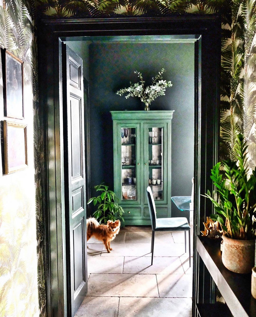
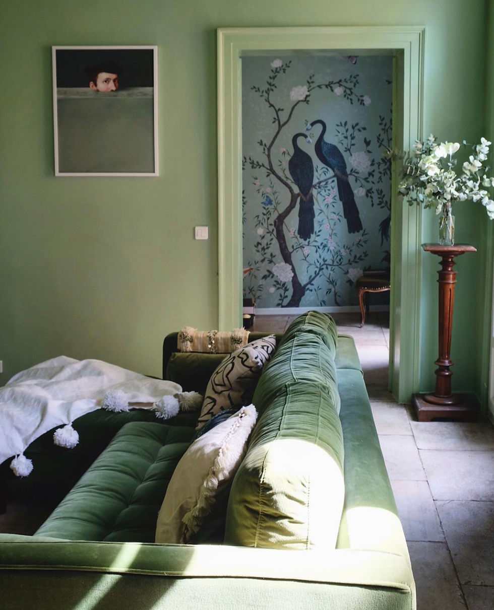
Instagrammers that have caught my eye with their fabulous use of green are @fig_tart seen here below at her place in Montpellier, France. Here she has leaned into both an oriental vibe and a plant loving look, but not too much of either, letting the colour shine through.


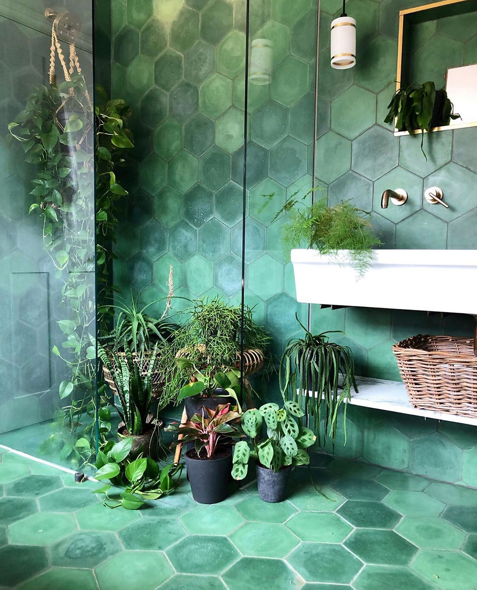
Another green I'm a fan of is @theoldpiggery. This bathroom has been stopping interiors types in their tracks for a while now! The variation of greens in these Moroccan tiles is just beyond beautiful and the white and natural toned styling an absolute dream.


Photograph Michaela @theoldpiggery
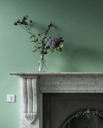
Another surprising colour I have enjoyed next to our mint is the colour of lilacs. Which is, of course, lilac, but as Anna Starmer says (and I love this phrase) 'to consider a colour you must first consider the surface', and to be frank I can only really bear lilacs and purples on flowers. Real flowers, not even on floral wallpaper. It's just too grannyish for me! But the little bunches of lilacs in this photo, that I can cope with!

Photo by Greg Penn www.instagram.com/manwithahammer
Here are some great greens to whet your appetite!

Arsenic - Farrow and Ball

Verditer Green - Little Greene Paint Company

Drunken Sailor - Fenwick and Tillbrook

The Perfect Storm - Fenwick and Tillbrook

Calke Green - Farrow and Ball


Comments